

TOOLS
FIGMA
ADOBE ILLUSTRATOR
ADOBE PHOTOSHOP
ADOBE INDESIGN
ADOBE ILLUSTRATOR
ADOBE PHOTOSHOP
ADOBE INDESIGN
YEAR
2026
2026
PROJECT BRIEF
Bridge Meals launched in January 2026 with a loosely defined brand and no paid marketing, so Instagram carried everything. The first six months were editorial triage, with each INSTAGRAM post made fast and one at a time. Once restaurant partners joined faster, that stopped working and the brand needed to become a system.
STRATEGY
Bridge Meals funds free restaurant meals through donations. Donors fund meals, restaurants serve them, and everybody eats. We built the brand around that logic and treated it as infrastructure, not charity.
Social strategy followed from it: organic only, with partner restaurants resharing as the main free distribution.
Social strategy followed from it: organic only, with partner restaurants resharing as the main free distribution.

LOGO
The icon began as a rough sketch from Will, Bridge Meals’ founder: a bridge set inside a circle. My job was to turn it into an identity. The wordmark is a plain grotesque that lets the symbol lead, suited to a brand that speaks simply. A few months in, its curves still bothered me. I redrew every arc from a set of ellipses, softened the corners and balanced the spacing between the bands. That version now carries everything from Instagram to print.


SYSTEM
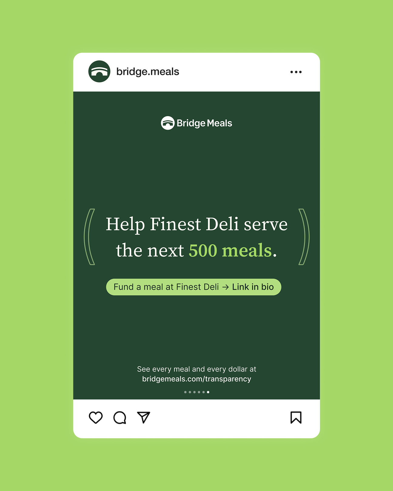
The arc from the logo became the system’s shape language. Drawn as a single loose stroke, the bridge arc becomes a pair of parentheses that bracket the line that matters most, on a closing slide or a business card. Brackets make room for whatever sits inside them, the same promise as “Everybody eats.” Outlined and repeated, the full bridge becomes a pattern for moments about the whole network, like the partner list on the back of the business card.
Source Serif 4 gives headlines a warmer voice against the plain wordmark. I documented the rules in a versioned guidelines deck, so print and social speak the same language. Photography keeps the focus on the restaurants themselves: their food, their spaces and the people who run them and the people who come to eat.
Source Serif 4 gives headlines a warmer voice against the plain wordmark. I documented the rules in a versioned guidelines deck, so print and social speak the same language. Photography keeps the focus on the restaurants themselves: their food, their spaces and the people who run them and the people who come to eat.



SOCIAL
Social is where the system works hardest. With no paid budget, one Instagram feed has to win over two audiences at once: donors to fund meals and restaurants to join as partners.
Each post type has its own job. Partnership announcements welcome a new restaurant. Update posts show what a partner has served after months on the network. Education carousels explain the ideas behind “Everybody eats” in a deliberately different visual voice. At the close, the parentheses and pattern bring them back to one brand, right where the post makes its ask.
Each post type has its own job. Partnership announcements welcome a new restaurant. Update posts show what a partner has served after months on the network. Education carousels explain the ideas behind “Everybody eats” in a deliberately different visual voice. At the close, the parentheses and pattern bring them back to one brand, right where the post makes its ask.


