TOOLS
ADOBE PHOTOSHOP
YEAR
2022
PROJECT BRIEF
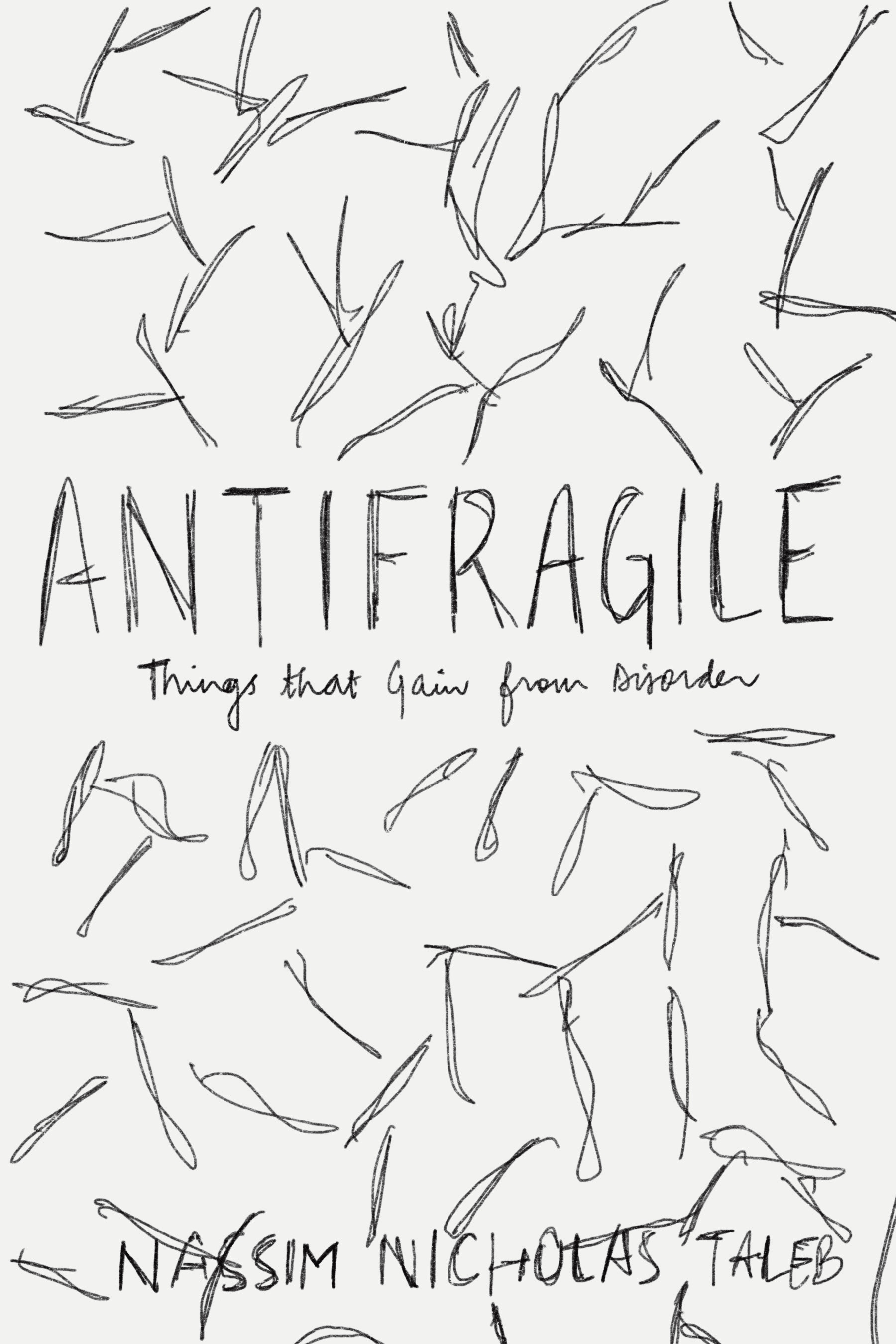
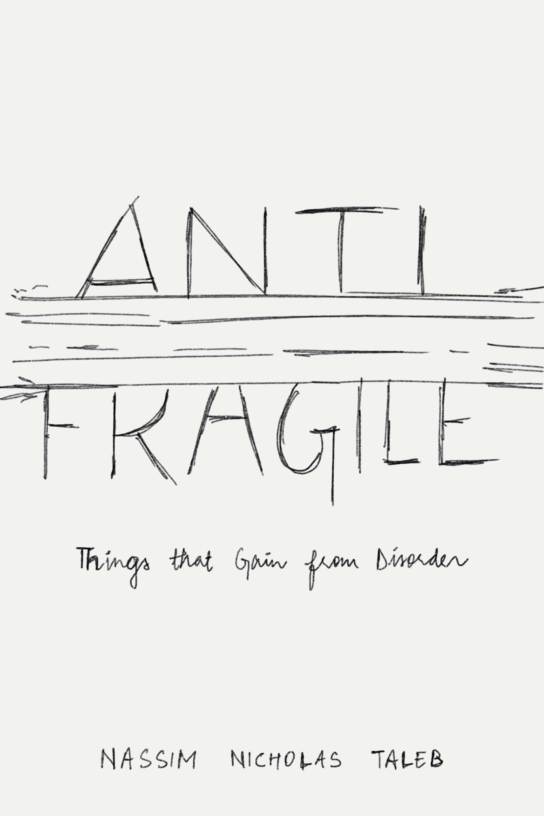
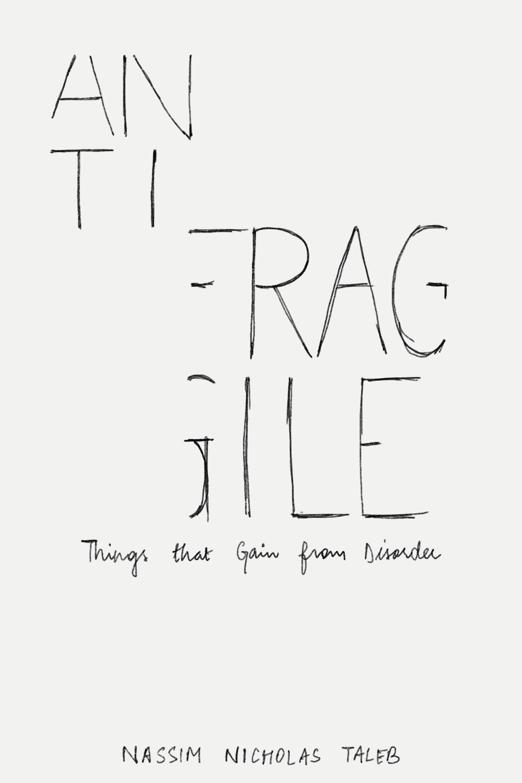
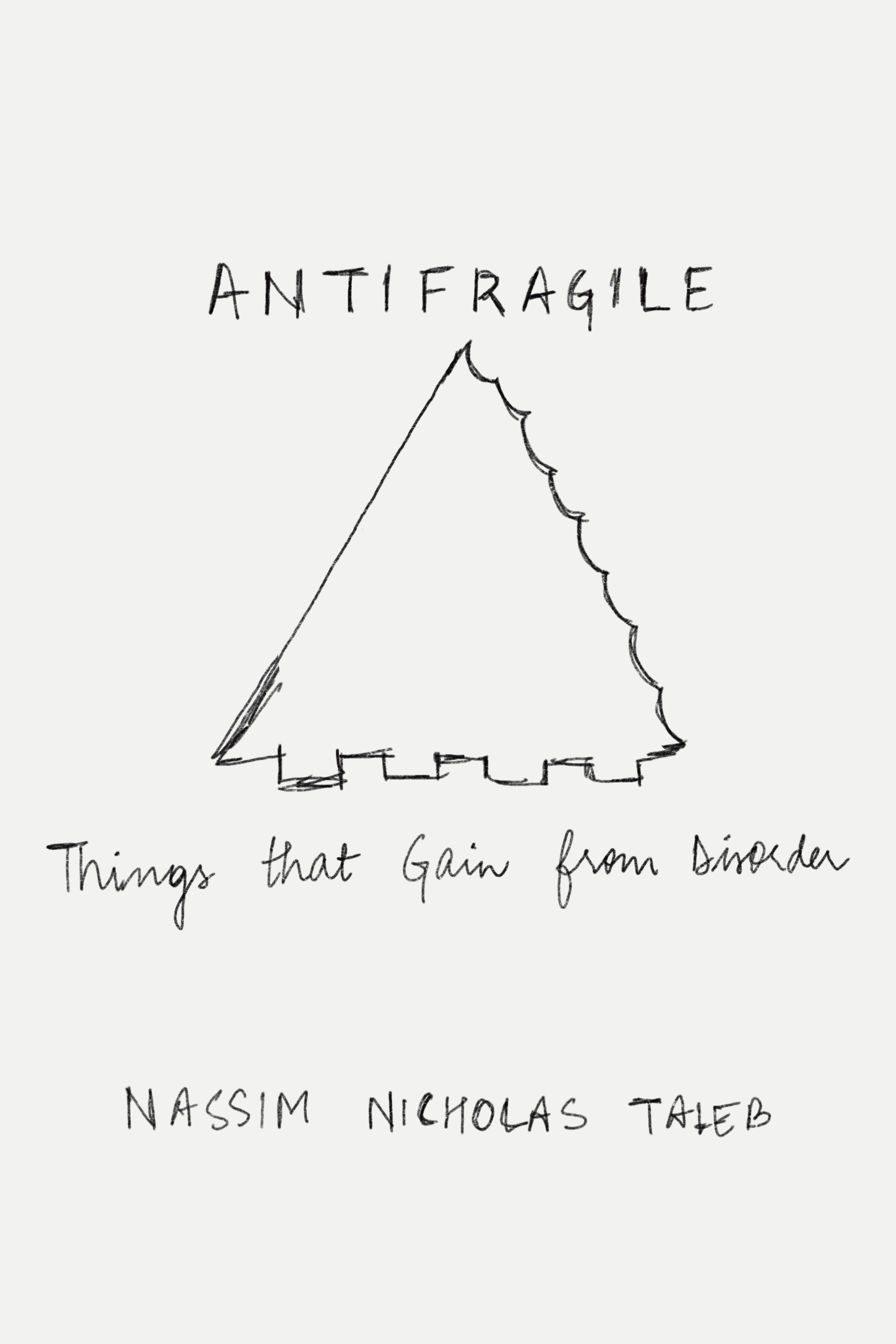
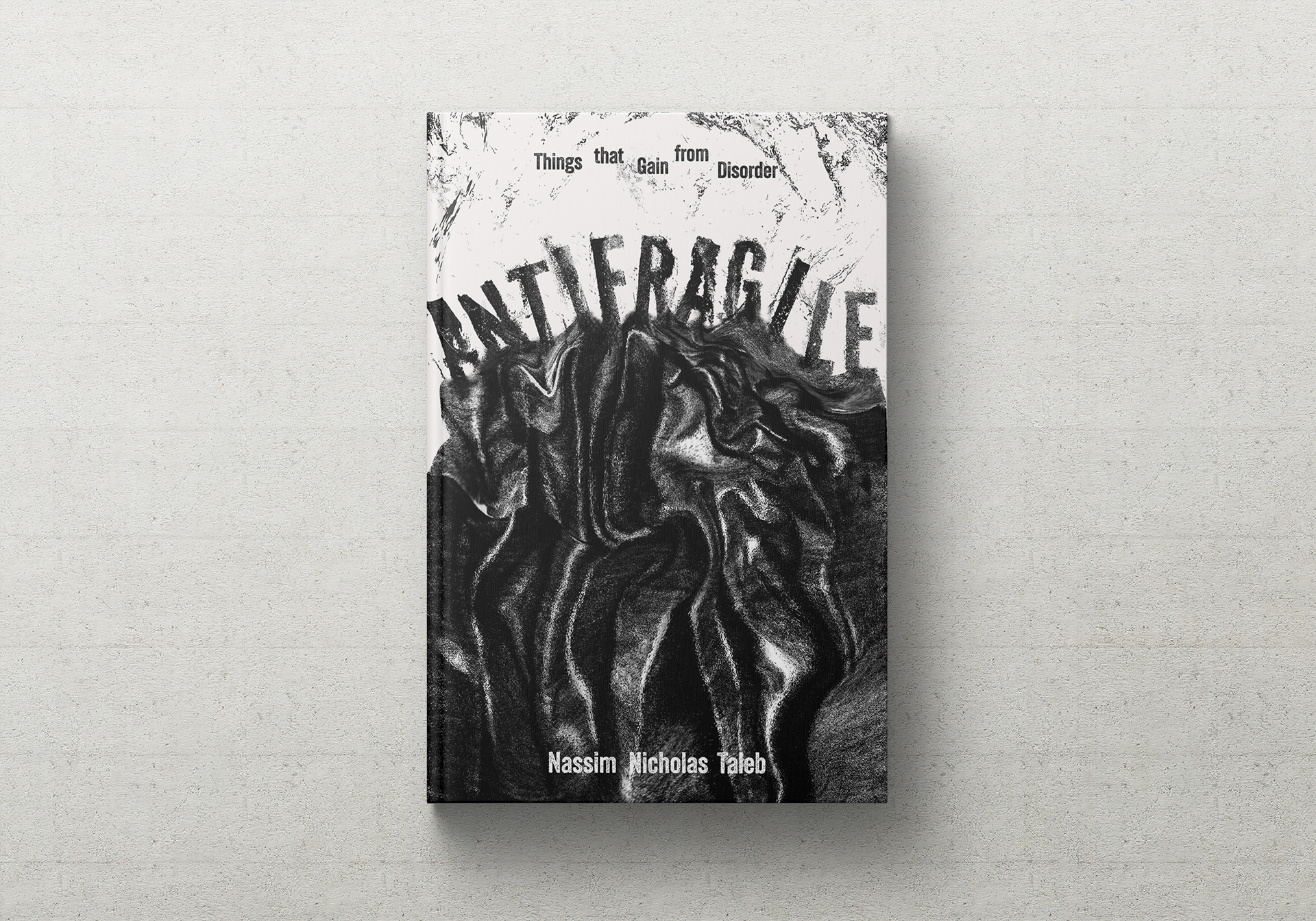
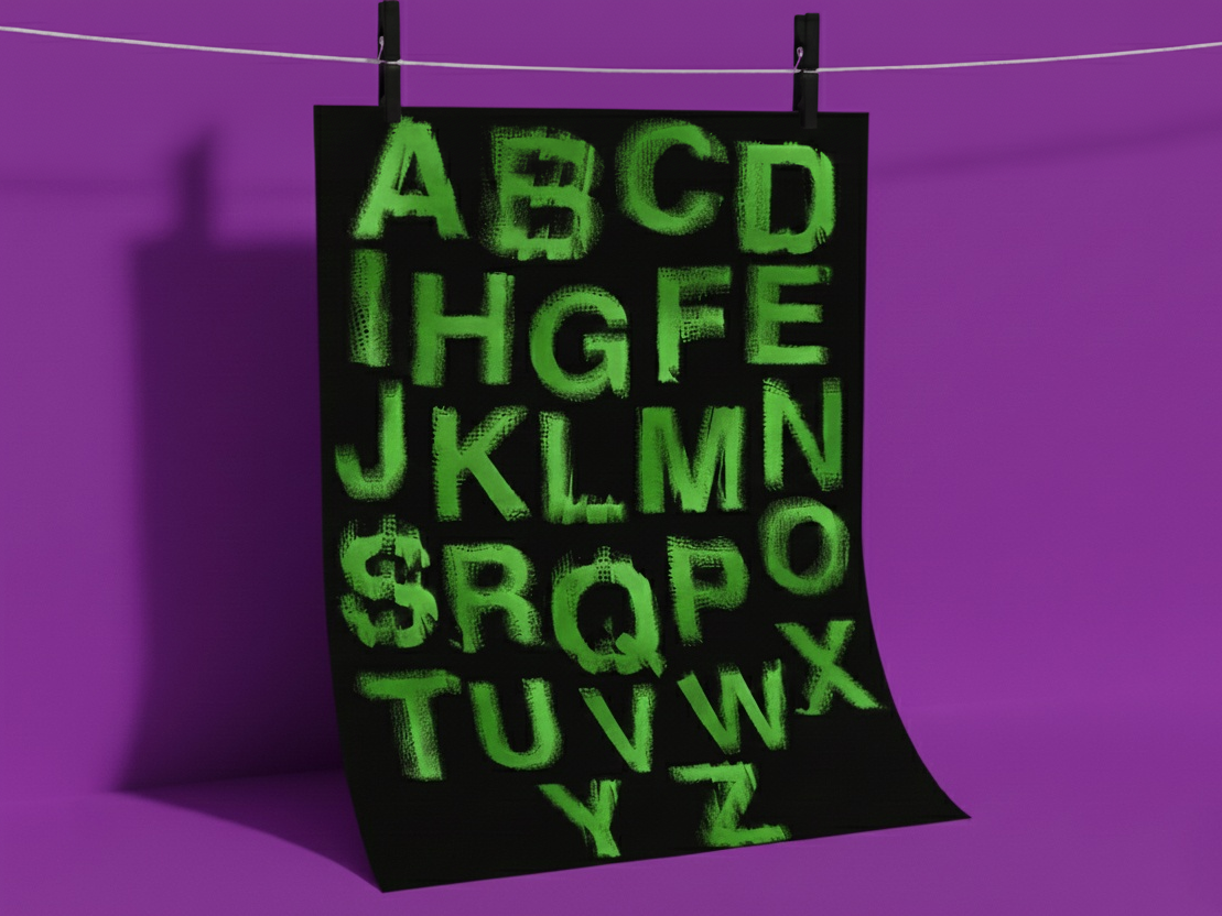
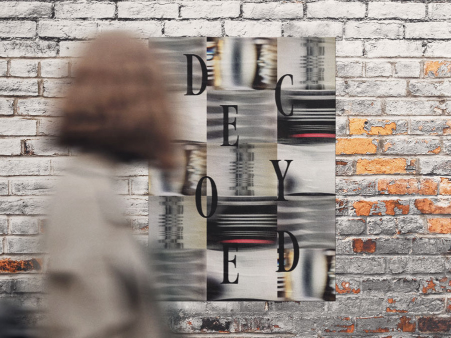
THE OBJECTIVE WAS TO DESIGN A BOOK COVER CENTERED ON TYPOGRAPHY, USING LETTERFORMS TO CONVEY THE BOOK'S ESSENCE. THE FOCUS WAS ON CREATING A COMPELLING DESIGN THROUGH TYPE, EXPLORING COMPOSITION, HIERARCHY, AND SPACE. THIS PROJECT ENCOURAGED PUSHING THE BOUNDARIES OF BOOK COVER DESIGN BY HARNESSING THE POWER OF TYPOGRAPHY.
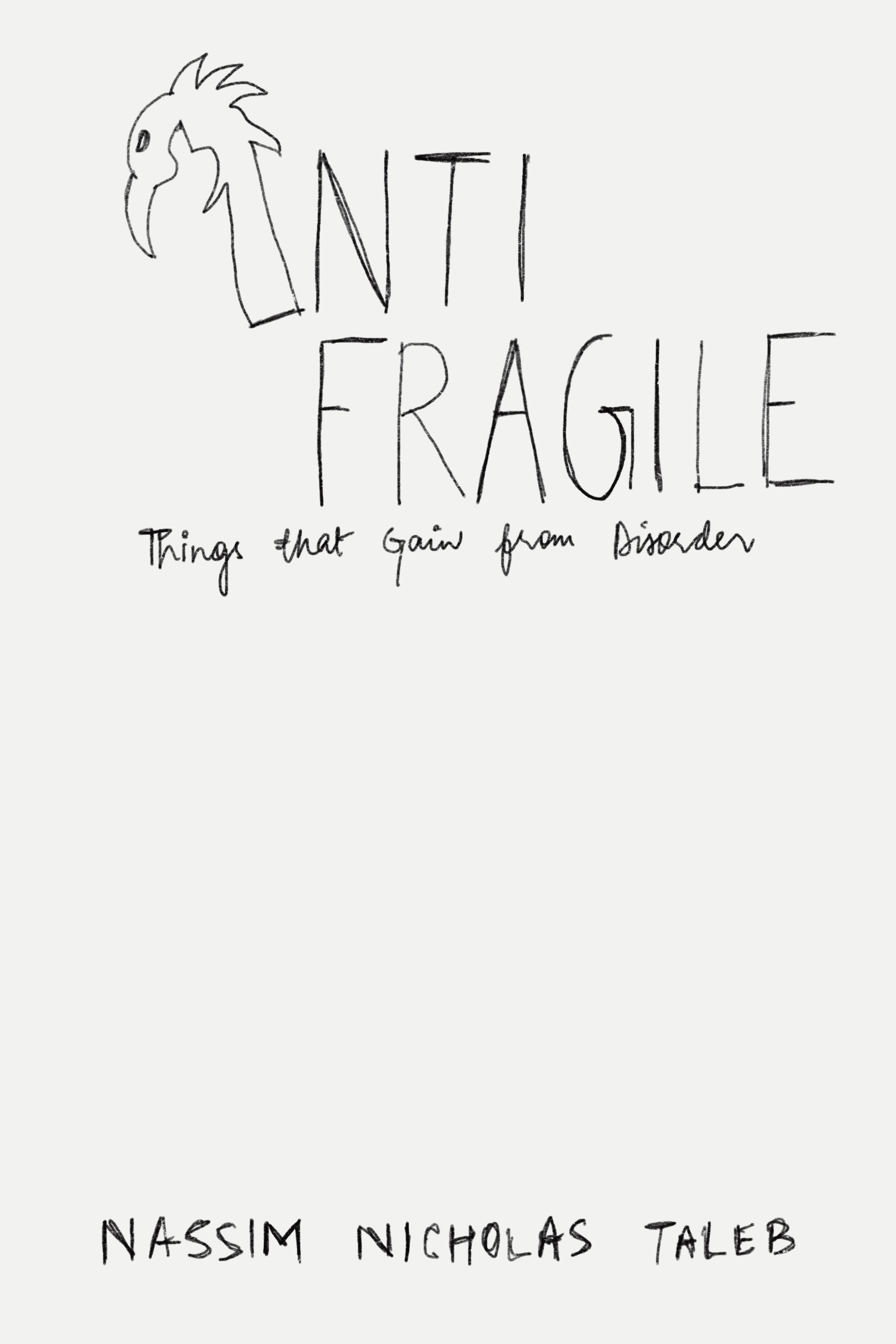
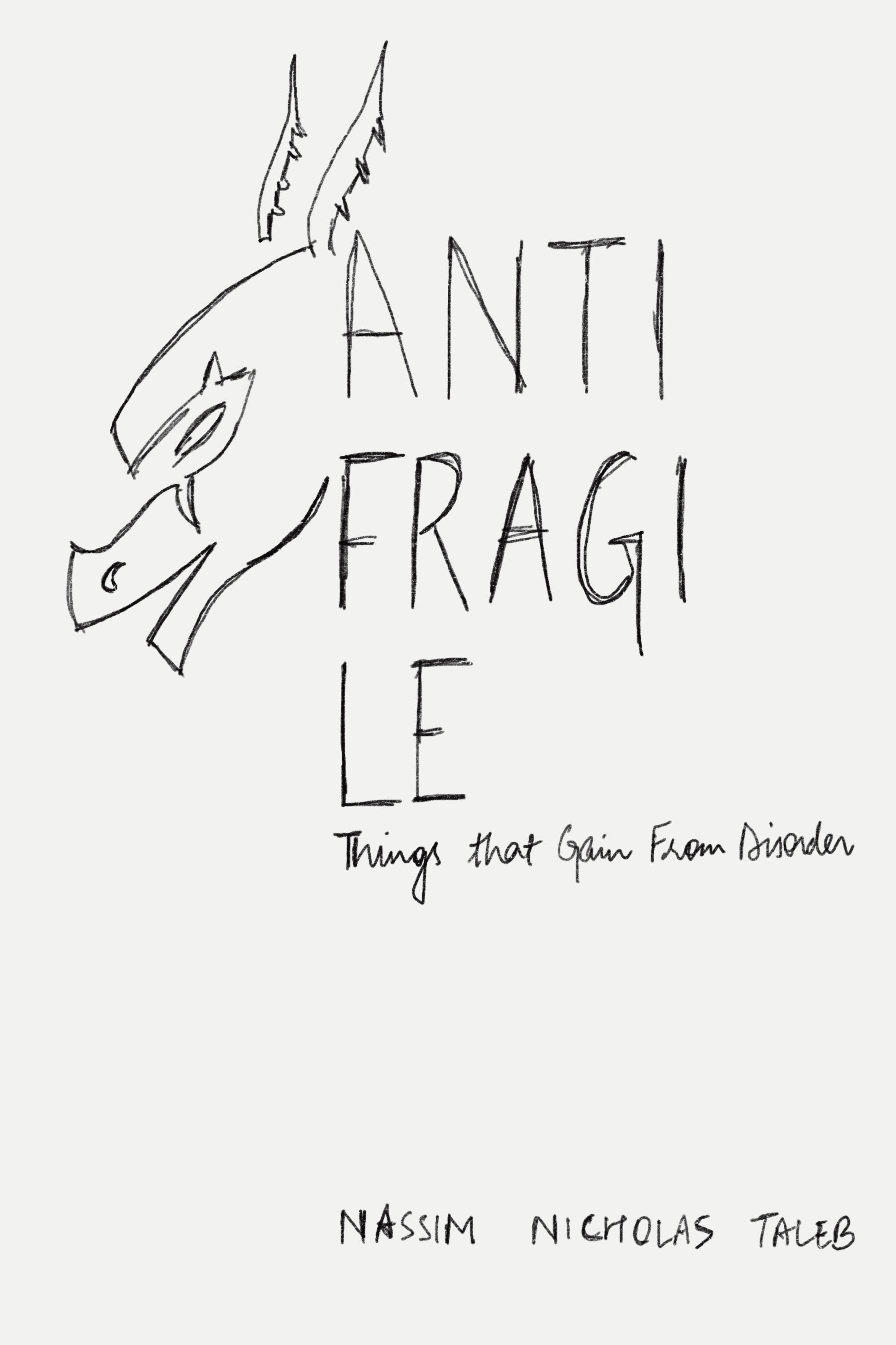
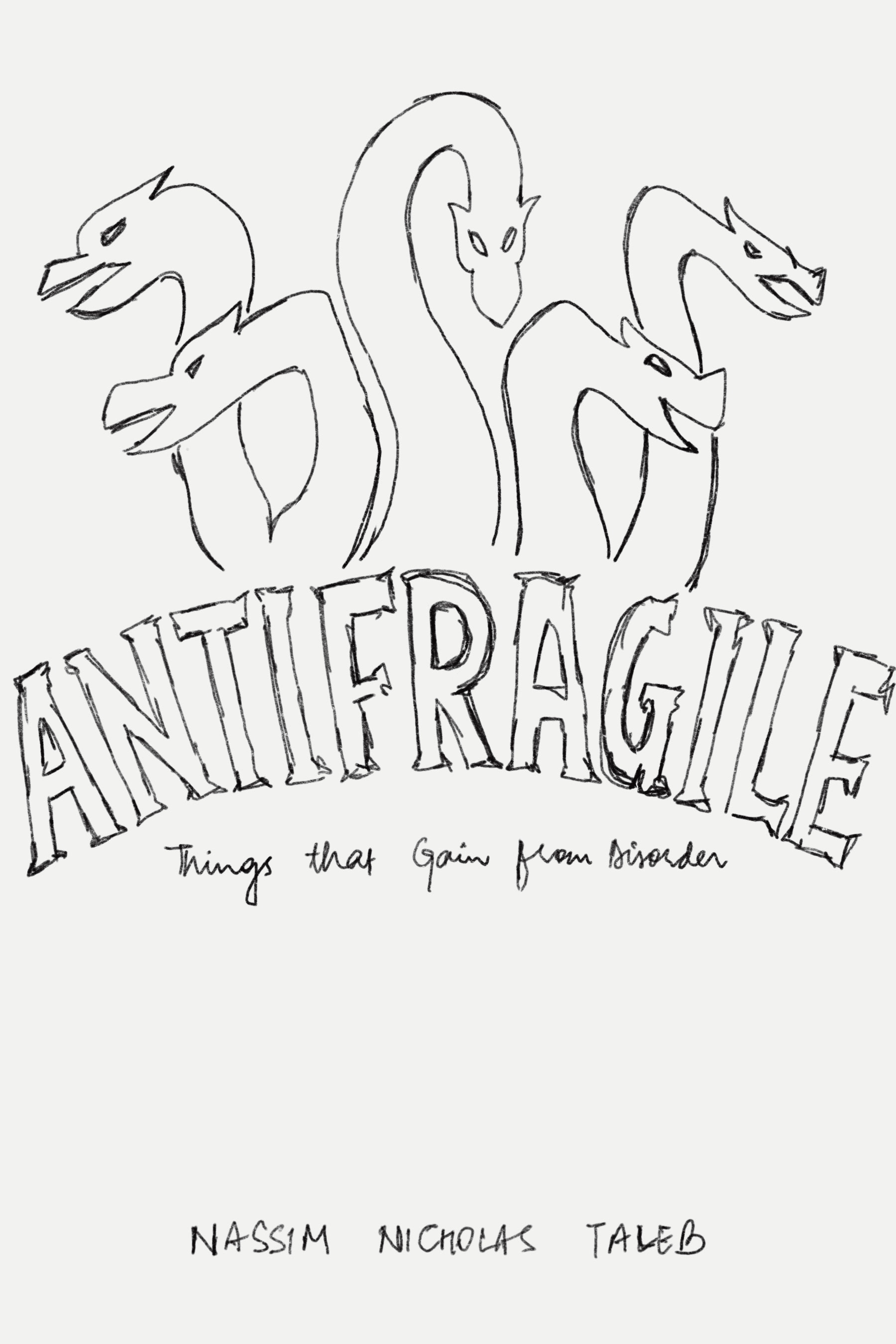
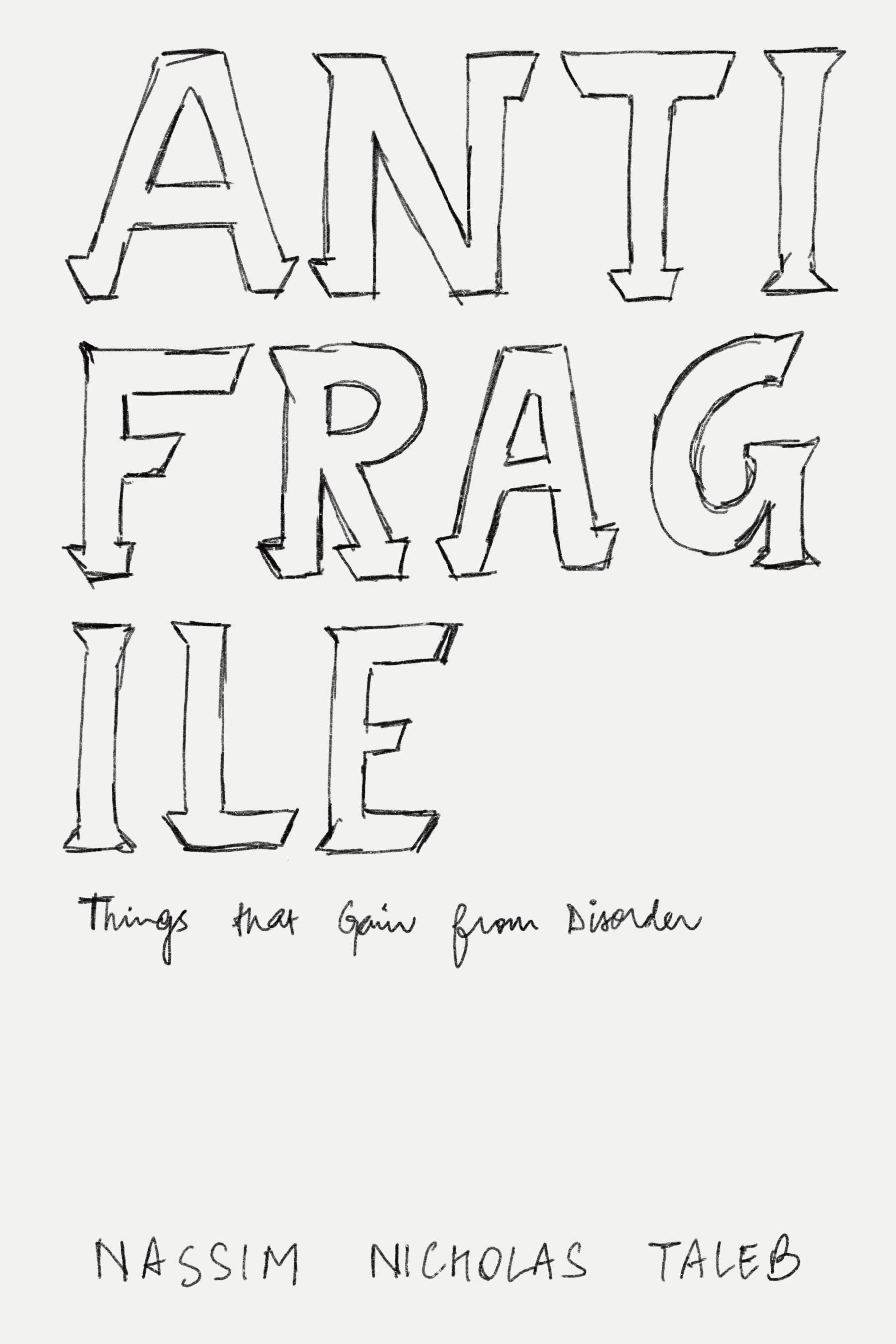
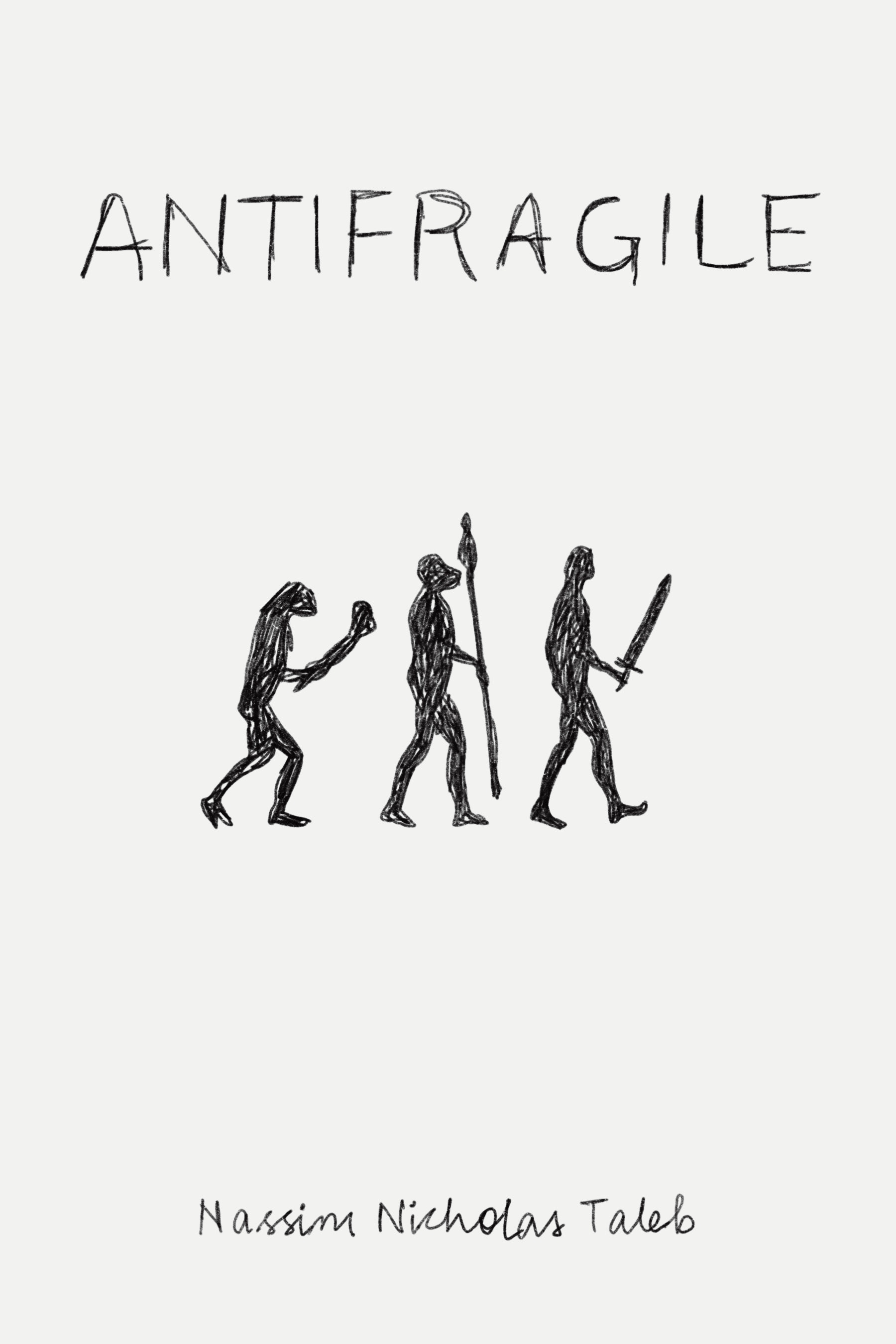
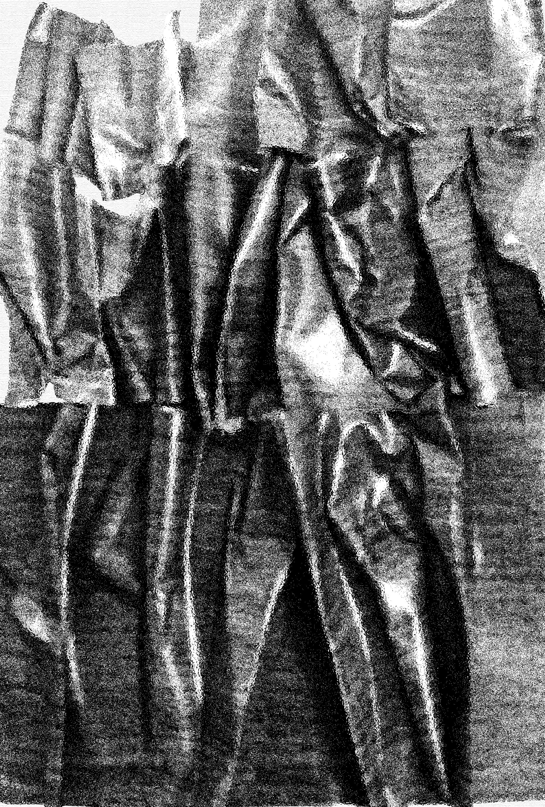
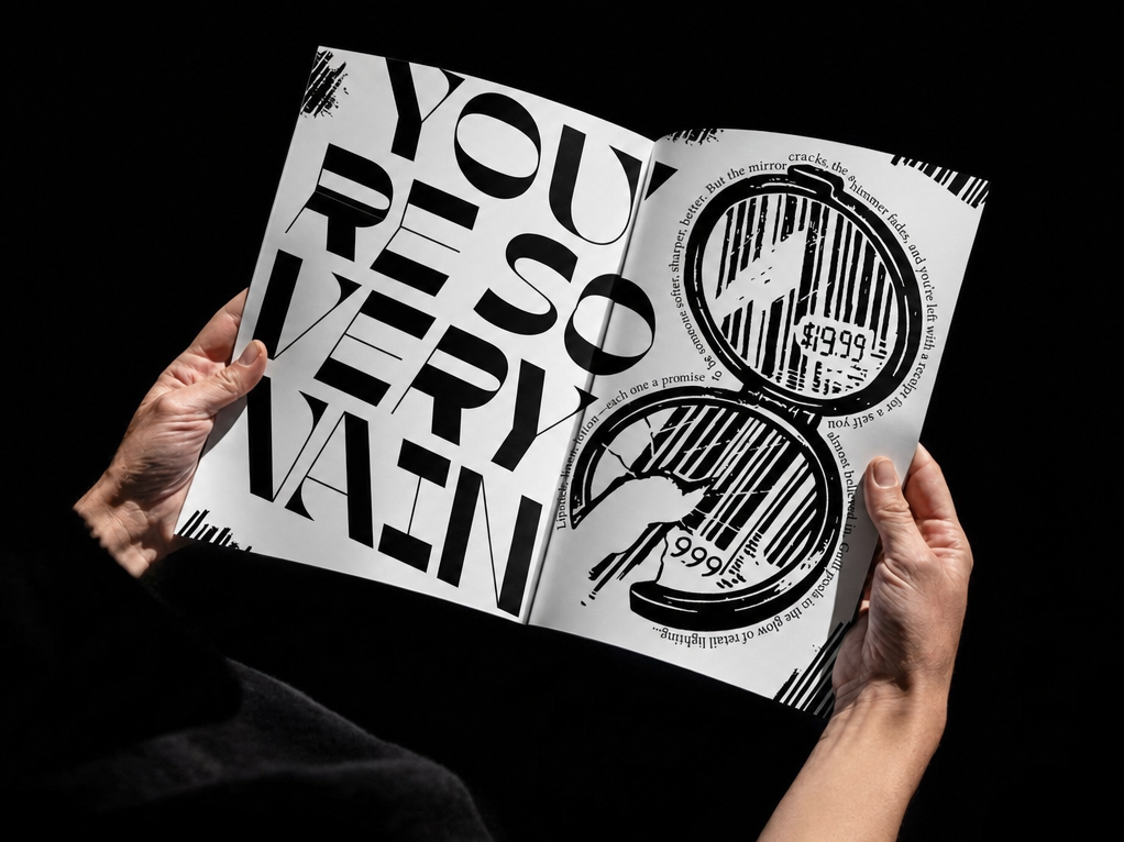
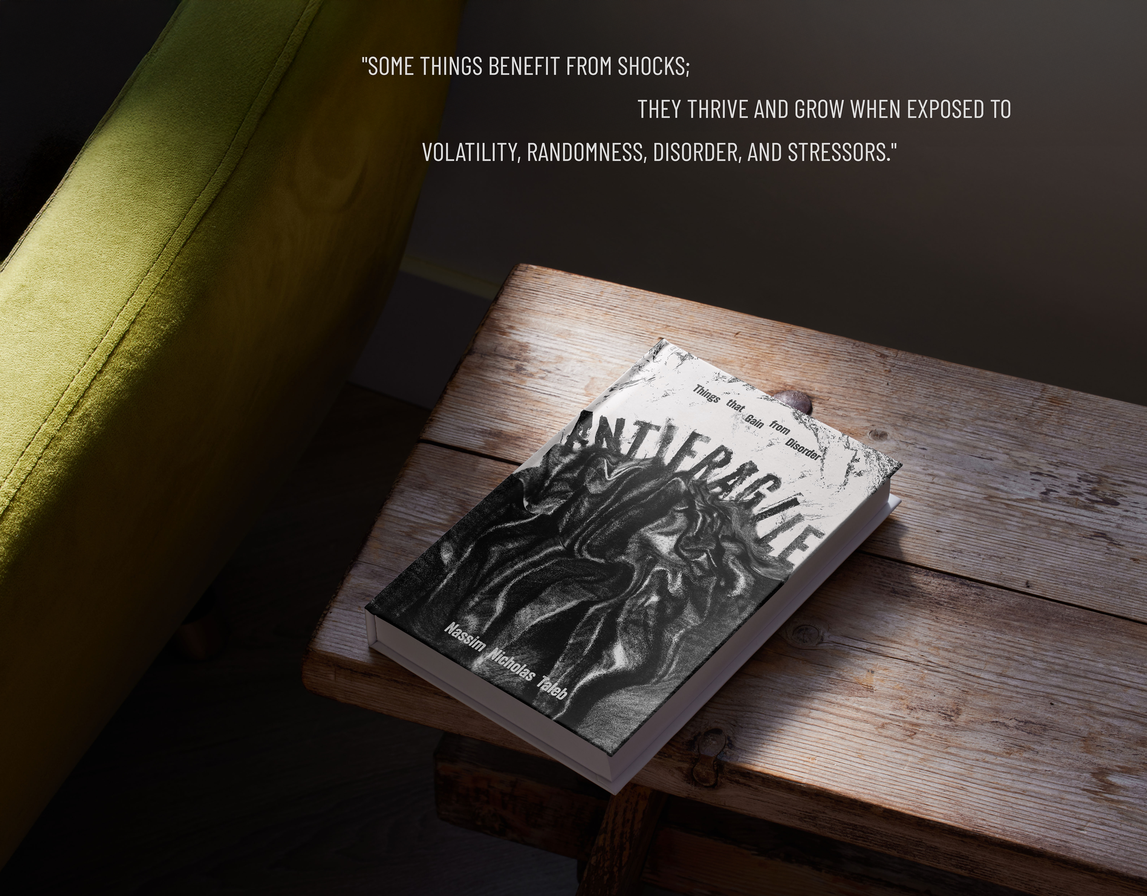
I CHOSE "ANTIFRAGILE" BY NASSIM NICHOLAS TALEB FOR THIS PROJECT. MY DESIGN APPROACH WAS DRIVEN BY THE BOOK'S CORE IDEA – THE ABILITY TO GROW STRONGER THROUGH ADVERSITY. I EXPERIMENTED WITH PHOTOGRAPHING VARIOUS MATERIALS AND TEXTURES, ULTIMATELY SELECTING A FOLDED PAPER TEXTURE THAT CLOSELY REPRESENTED LIFE'S UNPREDICTABILITY AND TUMULTUOUSNESS. THE INTEGRATION OF TYPE – FORMING ON TOP OF THE TEXTURE – RE-EMPHASIZES THE BOOK'S CENTRAL THEME: SOME INDIVIDUALS AND SYSTEMS NOT ONLY WITHSTAND ADVERSITY BUT THRIVE BECAUSE OF IT.